
FinFront UI SDK
One designer, five financial verticals, 75 components, and no room for drift between the docs and the product. Built Claude-first.
The problem
A trading terminal, an advisor workspace and a GP capital-raise desk all need to agree on color, numbers and what a severity flag means, without becoming the same app in five costumes. Meanwhile, trading platforms keep rebuilding the same order books and blotters, and private markets (cap rates, target IRR, GP/LP waterfalls) have almost no designed patterns at all.
Key decisions
- Make the library the source of truth, not a record of it. Every token, class and component is extracted from the five working prototypes' production CSS, so documentation can't drift from what it documents. Tokens follow a three-tier model (primitive, semantic, component), generated from JSON.
- Share foundations, scope the components. All verticals inherit one token layer, but each scopes its own component classes under a platform wrapper, so RIA's severity chip never collides with CRE's. A sixth vertical follows the rule instead of inventing a new one.
- Keep two color systems apart on purpose. One severity ladder (critical to low) runs across Prop Desk, RIA and Commodities. CRE & Alts gets its own capital-lifecycle colors (uncalled, invested, distributed), because forcing it onto the severity ladder would make two unrelated ideas compete for the same color. I logged that as a decision rather than quietly overloading a token.
- Document live, not static. Every component in the library is interactive. Switching theme, density or colorblind-safe mode restyles every demo across all five verticals at once, because the library runs on the same CSS custom properties as the prototypes.
How I worked with AI
I directed the research synthesis, personas and IA, visual language and tokens, and component behavior and interaction rules. Claude drafted fintech requirements docs, React / TypeScript and CSS scaffolding, and generated and QA'd the library sections, which let five verticals iterate in days instead of months. Every deliverable went through a headless render-and-check pass before it shipped.
Where I overrode it. The first render of the FX trading screen looked plausible but didn't hold up to a trader's eye: visual elements were misaligned, the column-customization controls in the upper right didn't work, and the RFQ buttons did nothing. The root problem was that Claude treated RFQ as one generic flow. I walked it through how the request-for-quote workflow differs by asset type, had it rebuild against those workflows, and re-checked every control before moving on. AI got me to a first draft fast; domain knowledge decided what was actually correct.
Outcome
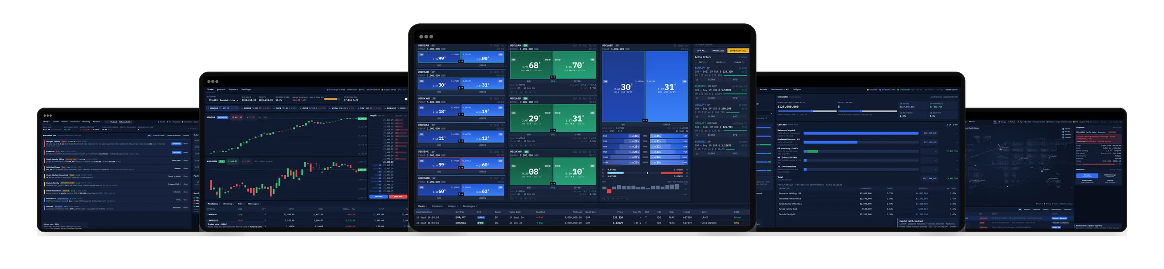
A headless React 19 / TypeScript library and design system with live demos, code, props and behavior notes, plus five working sector prototypes built on one token foundation.
Live component library walkthrough available in interviews.